Showing posts with label IB. Show all posts

Tuesday, November 18, 2008

IB Self-Portrait: part deux

Dark, glowing colors and contrast illuminate the Dubai skyline. Colors crash against the blue glass of the tallest skyscrapers that took only months to build.
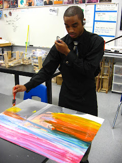
Bold outlines drag the colors out of the painting. Many of them are "dark and disturbing," as many say about some of my previous works. I am Leighton McDonald, the painter of the Tribal Tagged Self-Portrait. This painting took me four days(school days) to complete. Everything was done with acrylic paints. On certain areas of the paintings I used the high gloss to brighten and distinguish the acrylics for where and what they were used for. Again, I did not start with the background. Glad "Press-and-Seal" helps me to do my backgrounds with ease and precision. I just paint on top of the paper, and peel it after five minutes of application to reduce the chances of bleeding paint. The water consists of deep purples, light blue, marine blue and white. This is where the High-Gloss Emboss was used. I used a sponge to give the water a wave layer, making the water look even more transparent. Since I never follow the unwritten rules of art and never start with the background, I did decide to try "layering" the background and it turned out perfect for me. This is my 4th studio this year, and this blog can expect to see many more in the near future.

Thursday, November 6, 2008

Starry Night Ceramics in IB

My name is Chad Tomberlin. I am influenced greatly by my surroundings, while at the same time I try to find ways to incorporate an emotional aspect. The name Starry Night was a last minute decision. However, when i glazed the pot later on, it seemed to match perfectly. The current picture doesn't show the glaze - just the product after a bisque firing. When building this, I was going for a very simplistic style. At the same time, I wanted to incorporate something that would give movement to the piece. It took about 4 days to build the form and another week to sand it to perfection. Needless to say, I didn't attempt to build another piece for another month or so. This was an older one; however, I believe this was a turning point in my work from jumbled-up style in smaller pieces to a more elegant yet simple style.

Graphic Design and Tagging in IB Art

Hello, My name is Corey Chandler. I am a current
Senior at
Woodmont high school and I have been attending IB Art since my Junior year. Art is a major thing for me. I am looking to minor in Graphic Design at the college I will be attending. Art for me started in elementary school. I was always an advanced drawer and I made most kids drawings look really bad :). I recently found something that I really like to do, I'm not really sure what it is called. It kind of reminds me of Graphic Design because it looks like something that might be on a T-shirt or magazine. I started off with a picture that i took at home and edited on Photoshop. I used a filter to make the negative space in the picture to stand out. Once I did that, I printed the picture and went to work. I used acrylic paint to make the studio have a solid look and it made the picture of me look......good. :) Once I created the picture of me, I designed the background and the stencil of the hibiscus flowers. I think that this studio was one of the most successful pieces that I have done. I wanted to add more designs to this studio piece, but my space was very limited considering the size of this painting was 11"x 14". I have received numerous comments about this painting - not just by my classmates during the critiques, but by people in the halls, administrators, teachers, and many other people. My goal for this studio was to make it look tropical looking - maybe like a Hollister shirt. I think that I was successful because many people say that's exactly what it looks like. I think that I will continue to pursue Graphic Design and create many more pieces that will make people really look into my piece to get the main concept of the artwork.

Wednesday, November 5, 2008

IB Art Hors d'Oeuvres

My name is Chelsea Marqueda. I am a sophomore in IB Art. Art has always been my obsession. Only recently have I discovered what type of style I really like. Tim Burton is my hero. I really loved how he worked with ink and watercolor to create his characters in his movies. Gris Grimly is another artist I discovered. I am really fond of both of their artwork. I like the Pop surrealism and expressionist kind of feel, which both work quite nicely in. This is one of my first art pieces where I have used these styles painting. I adore IB Art because it allows you to discover what qualities make you unique, you have to embrace yourself to really create a working piece. This was my second studio of the year - expect the runny splatters to be reoccurring. I have trouble with technical, precise types of drawing. Over time skill can be learned; realistic things can be found any day. I really love using the paint to create a new kind of life. I like odd surreal situations that make you feel slightly uncomfortable. These type paintings require a little more thought and imagination.

Monday, November 3, 2008

Realistic Landscapes in IB Art

Hello, I'm James, a student in Mrs. Cauble's IB Art class. Currently I am trying to work toward the more realistic side of art. I really like drawing and painting landscapes. Most of my previous studios were landscapes, but they were not nearly as successful as this one. I made this all out of pencil - I used an ebony, 4b, 2b and an h pencil. Starting out, I did not really like it. I was having trouble with the roof of the barn. Once I started shading everything, that problem was solved - but I discovered that the white in the background (the area around and between the trees) was taking away from the snow-covered roof and the snow in the front of the barn. Also, I had to draw a line around the roof so you could see it. After I decided to shade the background a little, the snow really brightened up and I could remove the line. I really like working in pencil and hope to do many more studios with them.

Wednesday, October 29, 2008

Painting Greek Poses in IB Art

My name's Jenn Summers and I'm a student in Ms. Cauble's IB Art class. I'm a beginner and have little experience This painting was made with acrylic paints on a canvas panel. It was my second painting and I was trying to make the pose appear like the famous Greek discus thrower. James McDonald posed for me and I photographed him and used it for the colors. I gridded a black and white printout to draw the outline with. What was really funny about this painting was that it started out as a drawing. Ms. Cauble got me a canvas and I was sitting there for three days trying to shade a detailed drawing. Then, she came by and mentioned that canvas was for painting only. I took the drawing home and painted it one day while listening to the radio. My favorite part of this work was the jeans because I think the shading came out really well. The hardest parts were the face and the rack in the background. The face was really dark because it was in a shadow and I am still not really satisfied with how it came out. The rack had stuff in it that I tried to draw--badly. Ms. Cauble and Mr. Davis were really excited about the painting and were shocked that I did so well. Which surprised me, too. So, now I am going to paint another Greek pose piece pretty soon.

Thursday, October 9, 2008

Tribal Tagging Self-Portraits in IB Art

My name is Leighton McDonald and I am a Senior in a Higher Level IB class. I have taken IB art for 2 years and am now in my second year. This is a self portrait done in acrylic on wood canvas. This piece took me about one school week to complete. I began to express my new "electronic tribal" style in this piece. This new style makes the painting pop and it makes it seem busy but not to busy that it takes away from the main focus of the painting. The facial details contain many other colors that minor artists would not originally use. Purples, yellows, reds, and greens helped me build the facial shading that I originally wanted. The bold lines that surround the face make the face seem like a comic book illustration. In a recent critique, another artist said that the lines make that painting look 3- dimensional in a way. After wondering what made the painting pop, i came to the conclusion that the artist was right. The bold lines completely changed the way the painting looks. The lines and colors on the outside of the face were a free style of my imagination. I didn't purposefully mean to freestyle the painting, but I'm glad I did. I have gotten many great comments about the painting, but I still think there could be something else done to it.

Friday, October 3, 2008

Working with Realism in IB Art

Hello. :D My name is Darya Kaborda. I am in IB Art for the next 2 years. My field is realism. I love making things look realistic. If the drawing or painting looks like you can reach in and touch it, I will love it no matter what the subject is. I am sort of trying to achieve photorealism, in a way, but this piece doesn't demonstrate it. To start off, I gridded the canvas, and drew the lines in. Somehow, I ended up skipping or adding in a block at the bottom near her arm, so I have to fix that and incorporate the error into the drawing. The hair is what I was afraid of the most. It took the most time and patience. I usually never spend lengthy periods of time drawing hair in portraits, and, to be honest, this is my first real portrait of a person I know. The drawing is of Caley Doud, a good friend of mine. She took the picture for me, and I printed it out on 2 pages so it would be bigger than just one page. I wanted to be able to see the detail, but it failed. My printer didn't allow me to see most of the detail that the actual picture shows. I have to work from a torn up, colored, messed up photo of her, and that's a shame because I feel like I will not accomplish what I desire through that sort of reference. I wanted to make focus the main part of the drawing in the face, and I hope I have done that, even though the amount of hair can be distracting. It's difficult to shade accurately because of the reference picture, too. So far, I like the face the most. Her arm is poorly drawn, though. I need to fix it, still. At the moment, I am still going to spend some more time touching up the face, hair, and shirt. I have gotten a critique that the shirt needs to be worked on more, so I will take that advice and try to make the shirt look more realistic. After I finish the hair, I will be satisfied, and then I will do final touch-ups. That's about it. :D Thanks for reading. ^__^

- Darya Kaborda