
Visit our new web site at http://whsart.blog.greenville.k12.sc.us - we've moved from here to the district server.
Please note that this blog will no longer be updated - visit the new site for frequent updates!
Thursday, September 24, 2009


Monday, April 13, 2009
Texture Tiles in Ceramics Class
 I'm Ashley Pittman, and I,m in Mrs.Cauble's ceramics class. These are my texture tiles. The assignment was to make four tiles that had a conecting image or theme, and different textures on each tile. I put a quarter of a celtic knot on each tile, so that when they 're all together you see the whole thing. On each tile I put images representing one of the four elements; earth, water, fire, and air. I thought the elemental theme went well with the celtic knot, because both are ways that themes like unity or collaboration have been expressed. When I painted them I used layers of different shades of the colors to gives the images depth and to make parts stand out, like the tree and the swirls on the air tile. On the fire tile I painted the background black first, then went back and drybrushed yellow and orange on top tomake it look like the fire was lighting up the darkness around it.
Tuesday, March 24, 2009
This is ALL me!
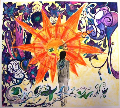
This is ALL me :) I'm Olga Kuzmik from Mr.Raglands Art 3 class. The painting to the left is the first piece I've done this semester. Not only that, but it's the first watercolor painting I've ever done. Originally it was only supposed to have the sun, the flowing design at the bottom and the girl but i couldn't stop myself once i started.The girl was supposed to be sitting facing the sun to show communication , since my theme is: "Isolation is the part of the human experience." After I started, I changed my whole idea and outlook on how I wanted it to be. The background has a variety of things "hidden," like a peacock, which is a constant thing I draw/sketch/paint every week for my visual journals. There is also a Russian church top in the background showing my heritage and something I'm proud of. If I was to do this painting over I'd fix things, change things etc. The mistakes that I DID have and fixed include when i dropped my paintbrush full of yellow paint and it rolled down my paper...I ended up having a big streak of yellow, to fix it I took a cotton ball dabbed it in painted throughout the background, problem solved! I had fun with this painting and I hope it shows :)
Monday, March 23, 2009
A Self-Portrait with Baltimore Swagg
 What's Gucci!
My name is Monet Johnson, I'm a junior and I'm currently in Art 3 in my favorite teacher Mr.Ragland's first block class.
I did this self portrait from a photo that I uploaded and printed from my cell phone. It took me a little over a week to complete and was not too difficult. I was happy finally get back to drawing since I have been working with watercolor and spray paint. Drawing is definitely my forte. I've always been drawing although I didn't take my first art class until my tenth grade year. This semester in art I'm supposed to develop a concentration and do twenty pieces. My concentration is "Salvation is possible for anyone". It consists of ties to religion, garish hip hop themes, city scenes, and bright colors.
This photo was black and white with high contrast. I was riding in the car with my boyfriend, Stannez, and the sun was shining on my face. I was very joyous and people have told me that it shows on the picture.My eyes were the easiest part of the drawing and the highlights in my hair were the hardest. I had to correct a lot in my nose and mouth areas. I was trying to draw them how they were "supposed" to look rather than drawing them how they looked in reality. When I did the highlights in my hair I had to erase pretty much all of it and start over. Those who know me, know that I love big bamboo earrings and doorknockers so the earrings we my favorite part to do. If I could have done anything different I would've done something more interesting with the background in the lower right portion. Also, my teeth look kind of dark and nasty compared to the light along the left side of my face. I should have made them lighter; they are pretty white in real life (not to sound too conceited). When I look at the picture I think about how me and my boyfriend were wearing matching military shirts that day. When I asked Mr.Ragland what I needed to change or improve he asked "Do you want me to be very, very picky?" and I said "Yeah" and trust me, he did. Mr.Davis also helped me with my eyes. I thank them for their input to make my picture beautiful.
I am a perfectionist and I never think my work is good enough. However, I can truly say that my picture is finished. I think it shows my personality and lives up to the potential of my Baltimore swagg.
Wednesday, March 11, 2009
Art 1 Linocut Prints

My name is Tymesha Walker. I am a junior in Mr. Ragland's Art 1 class. My linocut print was called "Deer Forest". When I first started the linoleum project, I really didn't want to do it because I thought it was too hard and boring. After seeing how good my first print looked, my whole attitude changed. I picked the colors dark yellow, red, and violet because I thought they were a great combination together and good for my picture too. I had to use hatching, cross-hatching, and stippling throughout my work in order to get different values and make it "the bomb". After awhile I start enjoying working with the linocut. My goals were to make my picture the best it could be and make my three colors look good together. I would love to work with this material again. I really enjoyed this experience!
Thursday, February 26, 2009
Spartan Spikes in Art 2
 Hey, my name is Amanda Shahan, I'm in the 10th grade, and I'm in Mr. Davis's Art 2 class. I named my piece "Spartan Spikes." We were given the assignment of making face jugs and my mind began to think creatively. I love medieval and dark clay pieces so i wanted to relate my face jug to that. I want to thank Mr. Markievich for helping me throughout the assignment. Without him this wouldn't have been possible. I first made two pinch pots that were close to being the same size, and then placed them together to make the head. I wanted to find a way to make a Spartan helmet hanging down off his face. So I then made a neck by making a coil pot, and then smoothed the pot into a triangular form. To make the helmet possible, I made many slabs of clay that I combined to make a helmet. A lot of slip was involved to keep the heavy slabs on. You can't really notice the spikes in his mouth due to the picture being so dark, but I cut small pieces of paperclips with a wire cutter and pierced them through the clay inside of his mouth. I myself thought that the eyes were a challenge because I wanted them to bulge out to make him more medieval scary. I first took a clay tool that looked like a tiny hook and scraped away the clay to make the eyes sink in, but then I placed the excess clay to make the eyes bulge out and give it the look of a medieval scary face jug. The one thing that you might want to watch out for while doing this process is to be mindful of how much you take away because of cave-ins. To make the eyes bulge I took a slab the size of my pinky finger and made that the white part of the eye. I then took another tiny slab half the size of the first one and made that the iris. To make the pupil I simply took a detail paintbrush and spun it smoothly on the tiny slab. You could also use a tool to get the same effect. When it comes to the magnificent color of my clay project, I used a glaze called "Black Ice". This glaze is a lot thicker and usually only needs one coat. Compared to last years clay pots in Art 1, I think I've improved astronomically. So far I can honestly say that this is my best piece of art this year, due to the fact I spent an extreme amount of time on it.
Wednesday, February 25, 2009
OH NOES!!1 I CAN HAS SCARY FACE JUG!
 I'm Maddie Fuller and I'm in the 11th grade. I took Ceramics last year, and am taking Art 1 this year. I really enjoy ceramics, but I also love sketching and painting. I'm going to take Art 2 next year.
For this assignment, I took a huge chunk of clay and made two pinch pots of the same size. Then I attached the pinch pots to make a hollow globe. I wanted my face jug to have a tongue spout, rather than a regular spout. I tried to incorporate the spout into the face of the jug, so I decided a tongue would be the best way to do that. I kind of accidentally slammed it on the table, and it made the bottom slant. I noticed that this made it look like a slug, so I decided to make the top of the jug into the face. Mr. Davis suggested that I add horns, and I liked the way they turned out. The teeth are made of broken white ceramic tiles.
For the glazes, I decided to make it look as realistic as possible. I used natural colors for the skin and tongue, and painted in the eyes so it looks like it's staring at you. This assignment was a really good way to start with clay in Art 1 - it teaches you all of the basic techniques, and they're really easy. I think this is one of my best pieces.
Face Jugs in Art 1
 Hey, my name is Aden Johnson. I'm in the tenth grade and am taking Art for the first time. I don't especially like to paint and draw, but I really like working with clay - anything hands-on. I go to Donaldson Center in the afternoons to take welding classes, and I'm going to be a certified welder and go into the Army after I graduate.
For this project, I made two pinch pots, then I slipped and scored them together. After I attached them, I cut a hole in the top and made a spout out of clay coils. For the face, I stuck two teeth made out of clay tile pieces, and made a moustache and eyebrows. I added three legs and handles for ears, then cut a nose hole and a mouth hole so the piece wouldn't explode. The legs came off in the first firing, but Mrs. Cauble showed me how to slip and score them back on with kiln cement. After it was fired, I picked green for the glaze - it's my favorite color. I liked this assignment - it kept me busy and I never got bored. I want to take Ceramics next year so I can do this stuff all semester.
Thursday, February 19, 2009
Musical Abstract Findings
 Aloha, my name is Chad Wise and I am currently in International Baccalaureate Art. The picture you see on the left is my latest studio. You may be thinking, "What is that?!" Well, to answer your question, it is an abstract drawing with different shapes and shading. I used a pen on the entire work. The 'pattern' that you see is a bunch of shapes that look like blades of grass overlapping each other. The three black zig-zag type shapes that you see are just random lines I drew and then connected. I shaded them in twice; the pen strokes went in different directions to make it darker. Another shape that is pretty interesting is in the top left-hand corner. Instead of connecting straight lines like the black shapes, I connected rounded lines. I then filled it in with dots, which gives it a contrasting look from the rest of the work. I believe this studio took me about two weeks to finish. None of it was really planned, it happened randomly. Of course, I knew the type of shapes I was going to use, but the placement was random. I worked on this while listening to music, and I can tell what type of music I was listening to when I worked on certain parts of it. Near the bottom-left, the blade with the black blade on the inside of it was the first one I drew. I used the darkened blade to remind me how I started. I do not know what to call this yet - Untitled #3 seems too ordinary, and yet is also fitting at the same time. I had a lot of fun on this studio; I felt that I was actually doing something that worked for the class. My previous studios are not as representative of me as they should be, this one is. -Chad Wise
Monday, February 9, 2009
Time Explosion in IB Art
 Hi, my name is Masha Harley. I'm in Mrs. Cauble's IB Art class. I started this painting when I was sitting at home being bored, but I never got to finish it. So I brought it into class, and Mrs. Cauble and I came up with few ideas. She suggested that I smear embossing powder on the painting and heat it with a heat gun. I thought it was a good idea - I tried it and it looks good. This painting doesn't really represent anything in particular, but time is definitely important to everybody and most people need more time. The powder expresses like an explosion of time, where everybody gets more time. The numbers in the background represent more images of time, and just give the painting more interest.
Monday, February 2, 2009
Welcome Mr. Markievich!
 Hello parents, caregivers, students, educators, administrators, and employees of Woodmont High School. I would like to introduce myself, as I have been granted the opportunity to complete my internship in this excellent school. My name is Eric Markievich, and I am currently attending a graduate program at Lander University for the Master of Arts in Teaching degree, and initial teaching certification. I received a BA Art from Penn State University, and am grateful to be furthering my education here in South Carolina. During my free time (which I have very little of these days!), I am involved in studio arts such as painting, drawing, and sculpture. I am also a musician and creative writer, and enjoy spending time in the great outdoors. I certainly look forward to this experience, and thank y'all for having me.
Welcome Mr. Moore!
 Hi, my name is Chris Moore and I am student teaching here at Woodmont High School for the spring semester with Mrs. Cauble. I am a Master's in Art Teaching Student who is also an active artist in South Carolina. I am currently a acrylic and encaustic painter whose work seeks to visually record the layers of information we experience daily. I feel that art education is a opportunity for students and individuals to create new appreciations for the craft and skill it takes to create the world we live in. I would like to extend my thanks to Woodmont's faculty and students for the opportunity to observe such exemplary educational standards and practices.
Friday, December 19, 2008
Love That Wraps Like a Vine

This is the mother of my mother, as known to everyone as my Grandmother. this painting only took me one week to complete, but I only worked on it for two actual school days. This was the first painting that I did that contained a person that wore obstructions on their face, so this was the hardest part to do for me. The background stands out the most because of the influence of the background-foreground illusion from the artist Kehinde Wiley, who paints portraits that are huge - about the size of a wall. The background was done with sponge and a point 3 brush. The face was mostly done with a sea sponge also, but the highlights and deep-cut shadows were done with a medium 3 point brush. The shirt was the second hardest thing for me to complete because I was extremely hesitant about adding purple and blue to make shadows and folds in the cloth. The light shadows on the shirt were down with yellows and white, then the highlights were just a lighter shade of that mixed yellow and white, or just white. I used the same concept on the earrings. This is my second painting of anyone other than me.
More Shoes in Ceramics

 Hey, my name is Camille Wilkins. I'm a sophomore and am in Mrs. Cauble's 1st period Ceramics class. Our assignment was to create a shoe out of clay. I started looking up pictures of shoes on the internet and I decided to make a replica of a Classic Adidas shoe. I am very satisfied with the way it came out because I was afraid that all the details I added wouldn't show. It took me about a week and a half to make this because I wanted to make sure I that didn't miss any details. I think the hardest part of making this shoe was painting it because there were so many small creases and that made it difficult to stay inside of the lines. We have had many great assignments to work on in Ceramics class, but I think that this was one of my favorites.
Making Shoes in Ceramics

 Hi, my name is Masha Harley and I'm in Mrs. Caubles Ceramics class, first block. She gave us an assignment to make a shoe out of clay. As I was thinking about what shoe I was going to make, I realized this assignment was much more difficult then the others we had. I eventually did a flat shoe. To make it more interesting and out of the box, I took a red ribbon and threaded it through the holes I made. The ribbon definitely made it more interesting!
Wednesday, December 17, 2008


Friday, December 5, 2008
Using the Inkle Loom in Art 2

 Hello! My name is Tiana Caple. I'm in the 11th grade, and I'm in Mr. Davis's Art 2 class. We just finished a new project using the Inkle Loom. First we learned to wrap the thread we wanted to use as the warp around the machine. The warp is another word for the color of the strings you've chosen. After that that you weave the string together which is called the weft. That's definitely the easiest part. The hardest part is the warping, because you have to be very careful to do it exactly right. The picture at the bottom is the piece that i made. I think it turned out really good. It didn't take me long to do it. I used pink, purple, and blue. The weft is white. I think this is easier than painting, and much more fun. It's fun, and not that complicated.
 Monday, November 24, 2008
Art 1 Visual Journals


Aloha, my name is Raquel M. Galios. I'm from Mr. Ragland's Art 1 class, 4th block. It's my first year of art and second year here at Woodmont. I'm from Hawaii, so naturally my work is going to be different. I love working with bold colors and dark outlines, so my work sticks out. Mr. Ragland has supported me in everything I've created, and made me feel like I can do anything. He is an amazing teacher, and major inspiration to my work. If not for this class, I don't think I would have explored this part of my life. I am also in his Drama 1, so most of my drawings were inspired from both classes. Soon I will have work reflecting designs on a Drama 1 project of Alice in Wonderland, both for the set and the costumes.
Friday, November 21, 2008
More Expressive Colors and Brushstrokes in Art 2
 Hi, my name is Natalie Piacenza. I am from Mr. Maddux's class. This year I have Mr. Davis's Art 2 class and it is the best! My painting is about my first day at Hillcrest High School. I was very nervous and it was raining hard and lightning. To show how nervous I was, I used grays and blues and diagonal lines. I used bright red and yellow to make the school and my bus stand out. I ended up liking it at Hillcrest High, but then I came to Woodmont High in the 11th grade. I like Art class because it is fun. This painting is the best thing I've ever done. I hope people like it.
Winter Scenes in Art 1: The Sequel
 Hey, I'm Emily Jones. I'm in the 9th grade. I am in Mrs. Cauble's Art 1 class. Ever since I was little, I loved watching my uncle Nat Jones draw. I soon became interested in drawing. In this assignment, we had to choose a picture to paint and make three changes to it. I chose a bird in a pile of snow. I changed it from a pile of snow to a rock and made it a night scene instead of day. I love the way this turned out, because as I sketched it it looked awful. As I began to paint, it started to look better. ^.^
Subscribe to:
Posts (Atom)

 Posts
Posts


