

Thursday, November 20, 2008
Winter Scenes in Art 1


Wednesday, November 19, 2008
Visual Journals in Art 2
 Hey, I'm David Rollings. I love to draw- I have since I was little. Me and my older brother Allan are the only people in our family that draw. My grandmother was the one who really encouraged me to draw. She always said that if I kept drawing, I would get better and better. So I did, I've been drawing since i was in kindergarten. I used to be obsessed with drawing hands, but lately I've been trying to draw people and poses more. This was actually one of my visual journal entries. What we have to do each week is do three journal entries. This was one of my first entries. It's a picture of my friend Wendy. The picture says "playing roulette with a flower," which is a lyric from the song "There's No Penguins in Alaska" by Chiodos. Chiodos is my favorite band. The picture went right along with the song so I decided to draw it. I used standard graphite pencils to draw this. I usually don't like my artwork, but this one is one i actually like.
Expressive Colors and Brushstrokes in Art 2
 Hey there! The name's Jaime Ferris. I created this work of art as a project in my Art 2 class. The goal was to make a painting explaining something that changed my life using specific colors and brush strokes to describe how I feel about it. I chose to paint about my growing ability to draw dragons. I started drawing dragons ofter my parents bought me a drawing book that explained how to add detail and how to make the dragons come to life. In my painting i used acrylic paint and then added shading with Prismacolor colored pencil over the top. Long smooth brush strokes helped to add to the mood of this painting. The pink and white swirls in the background stand for pure love that flows in harmony. The dragon is purple, which to me means passion. The burst of fire coming from the dragon's mouth represents excitement and joy. My favorite part about this painting though is how the dragon's eyes are always on you no matter where you are or how you turn the painting. Feel free to give any comments about my work!
Tuesday, November 18, 2008
IB Self-Portrait: part deux
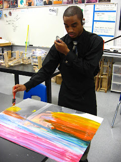 Dark, glowing colors and contrast illuminate the Dubai skyline. Colors crash against the blue glass of the tallest skyscrapers that took only months to build.
Bold outlines drag the colors out of the painting. Many of them are "dark and disturbing," as many say about some of my previous works. I am Leighton McDonald, the painter of the Tribal Tagged Self-Portrait. This painting took me four days(school days) to complete. Everything was done with acrylic paints. On certain areas of the paintings I used the high gloss to brighten and distinguish the acrylics for where and what they were used for. Again, I did not start with the background. Glad "Press-and-Seal" helps me to do my backgrounds with ease and precision. I just paint on top of the paper, and peel it after five minutes of application to reduce the chances of bleeding paint. The water consists of deep purples, light blue, marine blue and white. This is where the High-Gloss Emboss was used. I used a sponge to give the water a wave layer, making the water look even more transparent. Since I never follow the unwritten rules of art and never start with the background, I did decide to try "layering" the background and it turned out perfect for me. This is my 4th studio this year, and this blog can expect to see many more in the near future.
Friday, November 14, 2008
Parodies of "The Scream" in Art 2
 Hello, My name's Tabatha Neese. I'm in Mr. Davis's Art 2 class for third period. This had to be my favorite project so far. It's the first time I've actually used oil pastels. They are now my favorite medium to use. I think I did fairly well on this project. I used two characters from Fairly Oddparents which went along well with the theme. The theme was a parody to "The Scream". We had to either change the background with something that scared us or change the two characters in the front, Timmy and Vicki. The two characters in the front had to had some sort of rivalry. Timmy is scared of Vicki, and Vicki likes to torture Timmy. It didn't take me long at all to do this. I took it home, worked on it and finished it. I spent the most time on the green swirl in the middle representing a lake or pond of some sort, because I wanted to get the colors just right. I enjoyed this project very much, because I like cartoons and I like working with oil pastels.
Wednesday, November 12, 2008
Monochromatic Self-Portraits in Art 1
 Hi, my name is Kayla Thackston. I'm in Mr. Davis' 1st period Art 1 class (and by the way, he's an awesome teacher - already one of my favorites.) This is my self portrait painting. It took me a day and a half to finish. The second morning, it was kinda hard to get the same shade of purple that I had started out with. To get a lighter color, I added white and to get a darker color, I added black. I chose purple because it's my favorite color and actually, it turned out a lot better than I thought it would - although it could have been better. (LOL) He had us start out learning how to mix the primary colors to get secondaries and intermediates, and I've never done that before. It turned out pretty good. This isn't one of my favorite pictures that I've done in here, but it was really fun.
Tuesday, November 11, 2008
Color Reduction Linocuts in Art 1

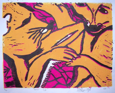
Hi everyone! My name is Tiffany R. Kijsamnong (kis-sam-nong). I am in the 12th grade, in Art 1 class with Mr. Ragland. This was my first time ever to do this type of printmaking. I call this print "Twisted Cubs". The reason for this name is because you can actually look at the picture in any way, and it still looks like 2 cubs playing (which was my intention). This took a bit of work and time. The process took a lot of pencil drawing at first, then transferring the drawing to the linoleum, tracing over the pencil lines with a sharpie, then cutting out sections of the linoleum with a cutting tool. We used a lot of ink. You can see I used the colors dark yellow, magenta, and black. I had to think about the colors in reverse and focus on hatching techniques for value. I didn't expect it to come out the way it did, but it worked out great. The things I would change if I could is maybe a little more detail and texture. I'd also like to try more than 4 colors. I really enjoy printmaking! One day I hope to continue this kind of thing in college. It's a really fun thing to experience and do. Art in general is an amazing thing. Not only the work, but the history. Give it a try sometime, you will find the fun in it.
Monday, November 10, 2008
Grid Self-Portraits in Art 2

Hola, my name is Joana Fuller. I'm in Art 2 with Mr. Davis. When we did this assignment, we had to take pictures in front of a lamp. I was trying to make my expression the saddest it could possibly be (if you know me, then you know that it is VERY hard for me to NOT smile). It turned out pretty good, but when I found out that we were supposed to use those pictures for our self-portraits, I freaked. I did grid drawings last year in Art 1 and it was very hard. While doing the portrait, I had to keep asking Mr. Davis, "Does this look right?" "Did I do this right?" And because of this assignment, I was given the name Negative Girl (thank you Mr. Davis). When I finally finished my portrait, I seriously didn't like it. I even offered to trade pictures with my buddy Ainsley. But in order for us to do that, we would have to trade faces... not a pretty picture....so yeah, I enjoyed doing this assignment because it helped me figure out that I'm actually good at some form of art. I plan on keeping this portrait to look back on all the good times I had in Art 2 with my awesome, wonderful art teacher Mr. Davis and our super huge art class...(sarcasm) :) I also plan on showing it to my future family. Maybe I'll include it in my will.....hmmm....
Friday, November 7, 2008
Environmental Linocuts in Art 2
 Hey. My name is Tiana Caple. I'm in the 11th grade, Class of 2010. I did my Linoleum Block print on nature. We were supposed to do a piece of art that expresses a cause. The meaning to my painting is this: "If you keep the world clean, then you will notice how beautiful it is." At first, we drew our copy on a piece of paper, then we transferred it to the block. Then we carved out the white parts that we wanted to cut out. The hard part was cutting out the little lines around each shape. I thought i was going to kill myself. Luckily I didn't. The easiest part was rolling the black ink on the block and printing four copies on the paper. Doing this project was really cool!
Thursday, November 6, 2008
Starry Night Ceramics in IB

 My name is Chad Tomberlin. I am influenced greatly by my surroundings, while at the same time I try to find ways to incorporate an emotional aspect. The name Starry Night was a last minute decision. However, when i glazed the pot later on, it seemed to match perfectly. The current picture doesn't show the glaze - just the product after a bisque firing. When building this, I was going for a very simplistic style. At the same time, I wanted to incorporate something that would give movement to the piece. It took about 4 days to build the form and another week to sand it to perfection. Needless to say, I didn't attempt to build another piece for another month or so. This was an older one; however, I believe this was a turning point in my work from jumbled-up style in smaller pieces to a more elegant yet simple style.
Linocuts in Art 1
 Hey, what's up, Internet people. My name is Zach Raymer and I am a senior here at Woodmont High School. I attended Hillcrest High School last year and I somehow got stuck in this class. At first it was a disappointment, and seemed to be a way to torture me through my senior year. After being in this class my mindset has changed. It's a pretty enjoyable class to attend every day. The assignment was to persuade people on a certain topic, or something that symbolizes a certain meaning in life. I chose a raised Football helmet in the air. The raised helmet symbolizes victory! This is shown many times during football in the big leagues all the way down to the pee-wee leagues. We had to carve out the design on a linoleum block - the objects we carved out turned out white. The portion on the linocut that was left uncarved remained black from the ink. After this time consuming process, we applied ink to the linocut and pretty much used it as a stamp. We pressed the linocut onto a sheet of paper and the design applied straight onto it. The assignment was a little tough because I chose to do something with little specific lines, which was the face mask. I had to take my time to get it just right. Some pieces didn't turn out as good as I hoped they would have, but overall I'm pretty impressed and proud of how the linocut turned out.
Graphic Design and Tagging in IB Art
 Hello, My name is Corey Chandler. I am a current
Senior at Woodmont high school and I have been attending IB Art since my Junior year. Art is a major thing for me. I am looking to minor in Graphic Design at the college I will be attending. Art for me started in elementary school. I was always an advanced drawer and I made most kids drawings look really bad :). I recently found something that I really like to do, I'm not really sure what it is called. It kind of reminds me of Graphic Design because it looks like something that might be on a T-shirt or magazine. I started off with a picture that i took at home and edited on Photoshop. I used a filter to make the negative space in the picture to stand out. Once I did that, I printed the picture and went to work. I used acrylic paint to make the studio have a solid look and it made the picture of me look......good. :) Once I created the picture of me, I designed the background and the stencil of the hibiscus flowers. I think that this studio was one of the most successful pieces that I have done. I wanted to add more designs to this studio piece, but my space was very limited considering the size of this painting was 11"x 14". I have received numerous comments about this painting - not just by my classmates during the critiques, but by people in the halls, administrators, teachers, and many other people. My goal for this studio was to make it look tropical looking - maybe like a Hollister shirt. I think that I was successful because many people say that's exactly what it looks like. I think that I will continue to pursue Graphic Design and create many more pieces that will make people really look into my piece to get the main concept of the artwork.
Wednesday, November 5, 2008
How do you like our new banner?
Thanks to John Abercrombie, in Mr. Davis's Art 2 class, who spent the period today using Photoshop to create our new blog banner. Excellent and professional job, John!
IB Art Hors d'Oeuvres
 My name is Chelsea Marqueda. I am a sophomore in IB Art. Art has always been my obsession. Only recently have I discovered what type of style I really like. Tim Burton is my hero. I really loved how he worked with ink and watercolor to create his characters in his movies. Gris Grimly is another artist I discovered. I am really fond of both of their artwork. I like the Pop surrealism and expressionist kind of feel, which both work quite nicely in. This is one of my first art pieces where I have used these styles painting. I adore IB Art because it allows you to discover what qualities make you unique, you have to embrace yourself to really create a working piece. This was my second studio of the year - expect the runny splatters to be reoccurring. I have trouble with technical, precise types of drawing. Over time skill can be learned; realistic things can be found any day. I really love using the paint to create a new kind of life. I like odd surreal situations that make you feel slightly uncomfortable. These type paintings require a little more thought and imagination.
Monday, November 3, 2008
Realistic Landscapes in IB Art
 Hello, I'm James, a student in Mrs. Cauble's IB Art class. Currently I am trying to work toward the more realistic side of art. I really like drawing and painting landscapes. Most of my previous studios were landscapes, but they were not nearly as successful as this one. I made this all out of pencil - I used an ebony, 4b, 2b and an h pencil. Starting out, I did not really like it. I was having trouble with the roof of the barn. Once I started shading everything, that problem was solved - but I discovered that the white in the background (the area around and between the trees) was taking away from the snow-covered roof and the snow in the front of the barn. Also, I had to draw a line around the roof so you could see it. After I decided to shade the background a little, the snow really brightened up and I could remove the line. I really like working in pencil and hope to do many more studios with them.
Thursday, October 30, 2008
Clay Masks in Ceramics
 Hello, my name is Brittany Phillips and i love fine arts! I'm not in IB Art or anything, but I'm in Mrs Cauble's Ceramics 1 class. We worked on lots of fun stuff, but halfway through the class Mrs. Cauble told us that we had to make face masks. We could make anything we wanted. At first I didn't know what I wanted to do, but then as i was looking at my wolf necklace I realized I wanted to make a wolf mask. It started out easy, but when I tried to make the ears look the same (and then the eyes) it became more difficult. That was nothing compared to the teeth! The teeth took a very long time because I had to make and place each tooth one by one in the mouth. It was hard to get to the inside of the mouth, but in the end it was really fun to make. Next is more clay fun!
XD.
Brittany
Wednesday, October 29, 2008
Painting Greek Poses in IB Art
 My name's Jenn Summers and I'm a student in Ms. Cauble's IB Art class. I'm a beginner and have little experience This painting was made with acrylic paints on a canvas panel. It was my second painting and I was trying to make the pose appear like the famous Greek discus thrower. James McDonald posed for me and I photographed him and used it for the colors. I gridded a black and white printout to draw the outline with. What was really funny about this painting was that it started out as a drawing. Ms. Cauble got me a canvas and I was sitting there for three days trying to shade a detailed drawing. Then, she came by and mentioned that canvas was for painting only. I took the drawing home and painted it one day while listening to the radio. My favorite part of this work was the jeans because I think the shading came out really well. The hardest parts were the face and the rack in the background. The face was really dark because it was in a shadow and I am still not really satisfied with how it came out. The rack had stuff in it that I tried to draw--badly. Ms. Cauble and Mr. Davis were really excited about the painting and were shocked that I did so well. Which surprised me, too. So, now I am going to paint another Greek pose piece pretty soon.
Illuminated Personal Manuscripts in Art 2
 Hi, my name is Brandon Andrews and I'm a junior at Woodmont High School. This is my second year being in art and I enjoy every minute of it. When I get to school everyday, I can't wait to get to my fourth block class with Mr. Davis. Creating art for me is a way to forget everything around me and focus on what I'm creating or drawing. When I first started this piece I had no clue what I was going to do. It was my first illuminated personal manuscript. Mr. Davis gave us some examples and from there it just "clicked" and i knew what to do. My favorite part of this piece is definitely the clock that shows 3:30. (That's the time we get out of school.) I also like the drama masks and how i used the different colors on the masks and how they project out into the sky. A lot of the object in here are stuff that I do daily, such as playing the guitar and the piano. I absolutely love music. I have to have music while I'm doing my art. I kind of helps me get to "that other world" where it's just you, the music, and what ever your working on. Another idea that i had was to draw a music staff coming out of my trumpet and the keyboard and wrapping around the entire page. It took me about a minimum of seven hours to do, but I really enjoyed working on it everyday. I hope that I will have more chances to create more pieces like this one.
Writing and Drawing Comic Strips in Art 1

 Mr. Davis's Art 1 classes recently learned how to create their own comic strip characters and write their own three panel comic strips. Students began by creating a large collection of original characters, and then gradually narrowing down the collection until they decided on a main character for their original comic strips.
Students planned out entire personalities for their main characters. They drew how the character spends a typical day, where the character works and goes on vacation, and what situations make the character feel strong emotions.
Using the characters and their personalities, Art 1 students wrote three-panel comic strips, using the setup/conflict/punch line formula. Students drew their final comics using the same materials comic strip professionals use - illustration board, pen and ink, and colored pencils.
Wednesday, October 15, 2008
Linocuts with Art 1
 Mr. Ragland's Art 1 students recently learned how to create 3-Color Reduction Prints using linoleum.
Using reference photos of animals, students did drawings featuring crosshatching, stippling, and hatching. No blended shading whatsoever!
Student transferred the drawings to rectangles of linoleum, and then used linoleum cutting tools to cut away the areas to be left white. Next, they printed their linoleum cuts one color at a time. For example, after printing black, students cut away all of the black areas and printed again using the next color. They did this three separate times, resulting in the beautiful three color prints you see in these photos.


Subscribe to:
Posts (Atom)

 Posts
Posts


