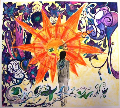
This is ALL me :) I'm Olga Kuzmik from Mr.Raglands Art 3 class. The painting to the left is the first piece I've done this semester. Not only that, but it's the first watercolor painting I've ever done. Originally it was only supposed to have the sun, the flowing design at the bottom and the girl but i couldn't stop myself once i started.The girl was supposed to be sitting facing the sun to show communication , since my theme is: "Isolation is the part of the human experience." After I started, I changed my whole idea and outlook on how I wanted it to be. The background has a variety of things "hidden," like a peacock, which is a constant thing I draw/sketch/paint every week for my visual journals. There is also a Russian church top in the background showing my heritage and something I'm proud of. If I was to do this painting over I'd fix things, change things etc. The mistakes that I DID have and fixed include when i dropped my paintbrush full of yellow paint and it rolled down my paper...I ended up having a big streak of yellow, to fix it I took a cotton ball dabbed it in painted throughout the background, problem solved! I had fun with this painting and I hope it shows :)
Tuesday, March 24, 2009
Monday, March 23, 2009
A Self-Portrait with Baltimore Swagg
What's Gucci!
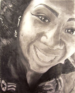
My name is Monet Johnson, I'm a junior and I'm currently in Art 3 in my favorite teacher Mr.Ragland's first block class.
I did this self portrait from a photo that I uploaded and printed from my cell phone. It took me a little over a week to complete and was not too difficult. I was happy finally get back to drawing since I have been working with watercolor and spray paint. Drawing is definitely my forte. I've always been drawing although I didn't take my first art class until my tenth grade year. This semester in art I'm supposed to develop a concentration and do twenty pieces. My concentration is "Salvation is possible for anyone". It consists of ties to religion, garish hip hop themes, city scenes, and bright colors.
This photo was black and white with high contrast. I was riding in the car with my boyfriend, Stannez, and the sun was shining on my face. I was very joyous and people have told me that it shows on the picture.My eyes were the easiest part of the drawing and the highlights in my hair were the hardest. I had to correct a lot in my nose and mouth areas. I was trying to draw them how they were "supposed" to look rather than drawing them how they looked in reality. When I did the highlights in my hair I had to erase pretty much all of it and start over. Those who know me, know that I love big bamboo earrings and doorknockers so the earrings we my favorite part to do. If I could have done anything different I would've done something more interesting with the background in the lower right portion. Also, my teeth look kind of dark and nasty compared to the light along the left side of my face. I should have made them lighter; they are pretty white in real life (not to sound too conceited). When I look at the picture I think about how me and my boyfriend were wearing matching military shirts that day. When I asked Mr.Ragland what I needed to change or improve he asked "Do you want me to be very, very picky?" and I said "Yeah" and trust me, he did. Mr.Davis also helped me with my eyes. I thank them for their input to make my picture beautiful.
I am a perfectionist and I never think my work is good enough. However, I can truly say that my picture is finished. I think it shows my personality and lives up to the potential of my Baltimore swagg.
Wednesday, March 11, 2009
Art 1 Linocut Prints
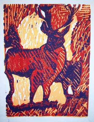
My name is Tymesha Walker. I am a junior in Mr. Ragland's Art 1 class. My linocut print was called "Deer Forest". When I first started the linoleum project, I really didn't want to do it because I thought it was too hard and boring. After seeing how good my first print looked, my whole attitude changed. I picked the colors dark yellow, red, and violet because I thought they were a great combination together and good for my picture too. I had to use hatching, cross-hatching, and stippling throughout my work in order to get different values and make it "the bomb". After awhile I start enjoying working with the linocut. My goals were to make my picture the best it could be and make my three colors look good together. I would love to work with this material again. I really enjoyed this experience!
Subscribe to:
Posts (Atom)